Gogo
This project was huge.
My team and I were taking on the most well-known, and go-to car listing websites of Perú. It took months of planning and preparation before undertaking any design.
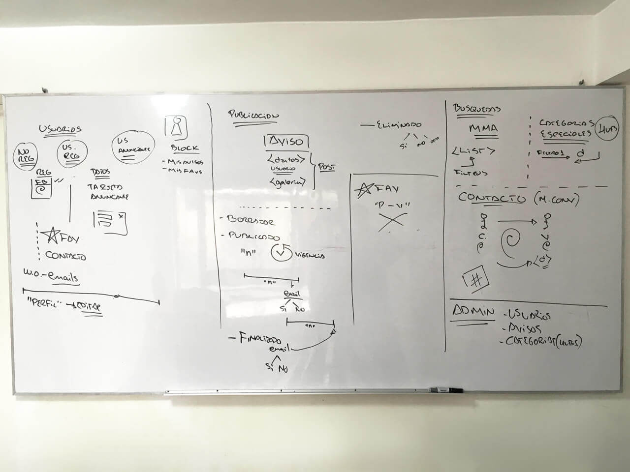
We wanted to address the most common issues that the current market had: Bad usability and user experience, getting started, and fake and scam posts.
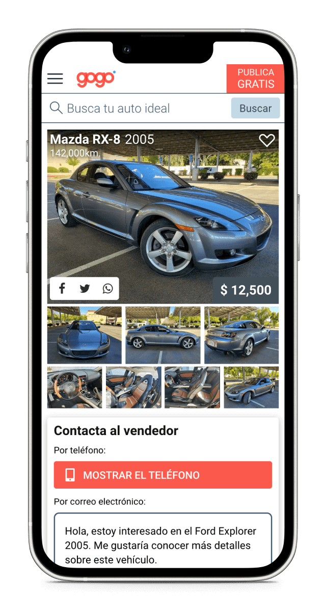
For increasing usability and improving user experience we identified and focused on the two most common user flows: Creating posts and searching.
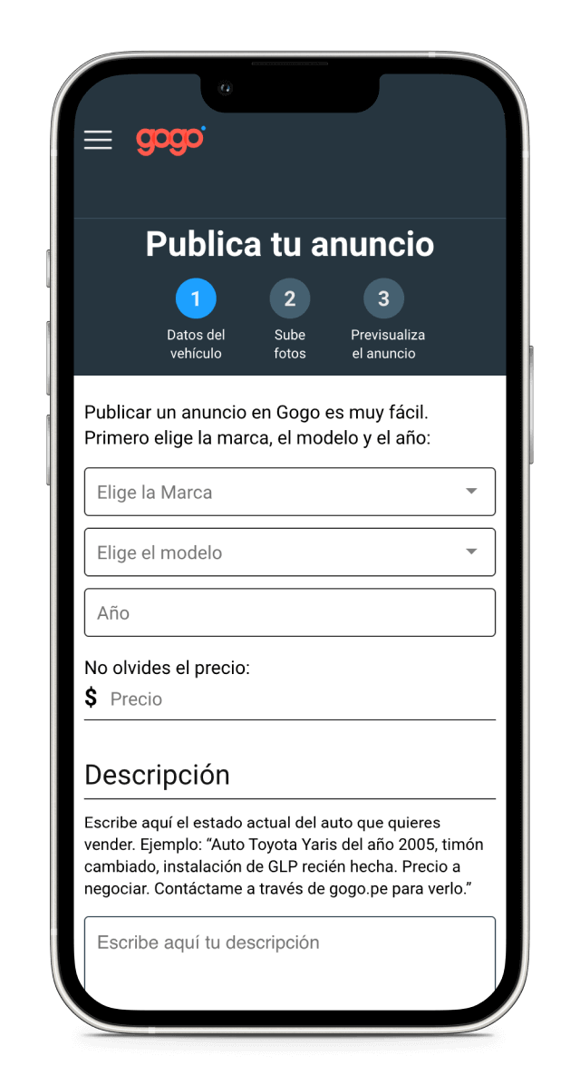
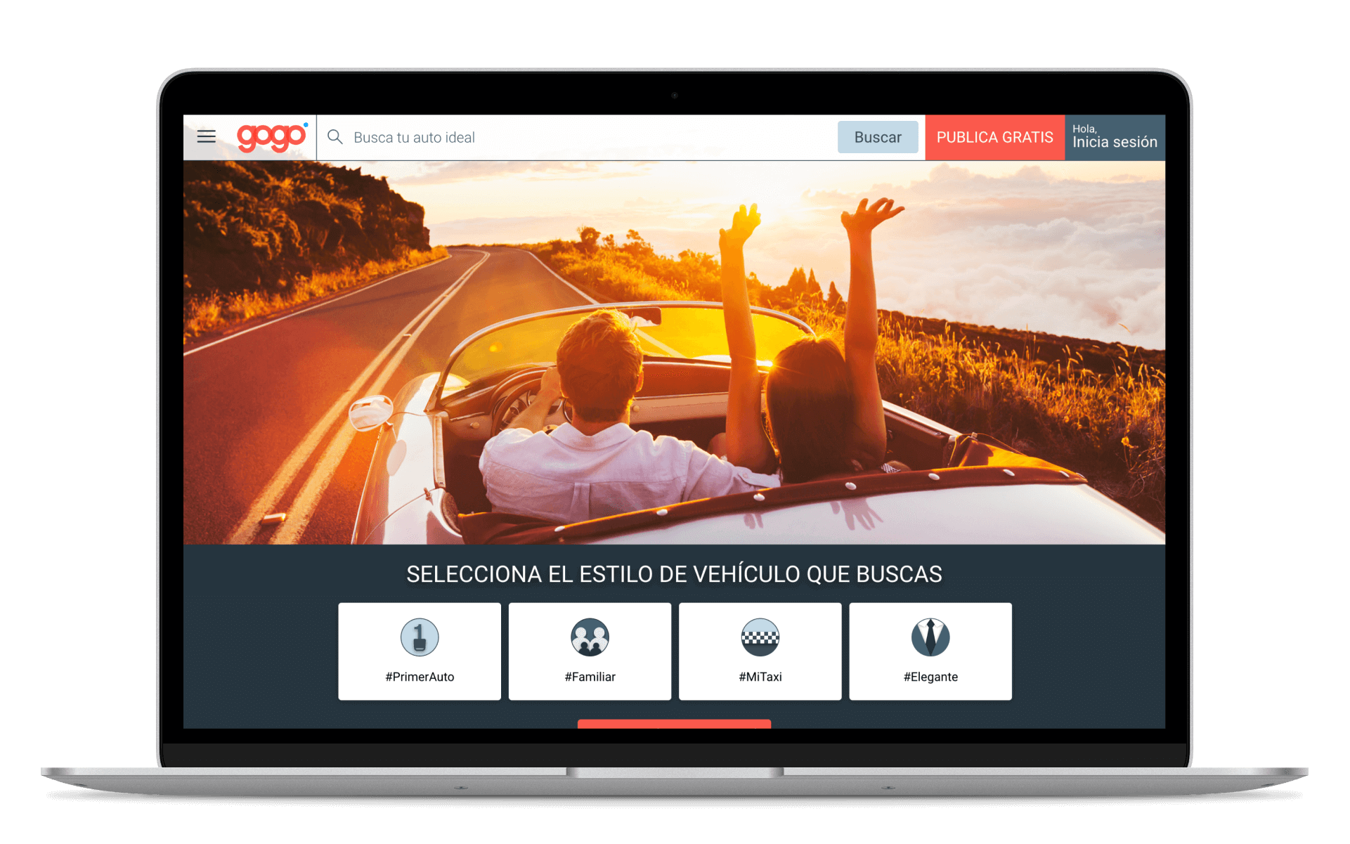
Streamlined the process of getting a car posted, requiring the least amount of effort and steps to get it done, while guiding the user. Narrowed the steps down to 3.
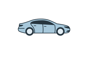
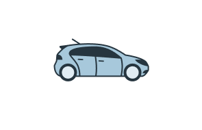
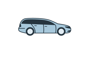
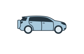
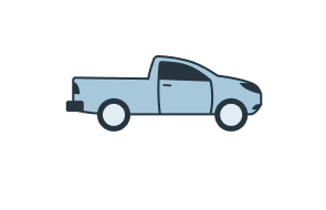
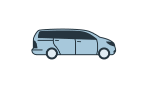
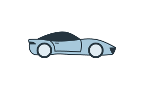
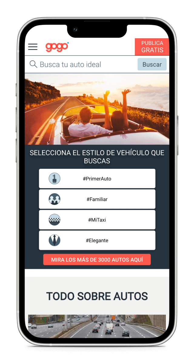
For searching, we worked on achieving fast loading times while searching and filtering. We also created 4 categories that would apply filters based on different scenarios that we identified would be the most common for people looking to buy a car: Family car, First car, Work car, High end.


We kept scanning the site looking for possible fraudulent posts, when found we took them down and let the post's owner know, so they had the chance to rectify the information and re-upload the post if they decided to. This helped make Gogo the most curated and secure site.
Until it was shut down some years after the release, it was one of the most active sites, getting new posts on a daily basis.