Kambista
- UX & UI Design
- Branding
The legacy platform suffered from bloated, unintuitive user journeys that fractured the experience and hindered task completion.
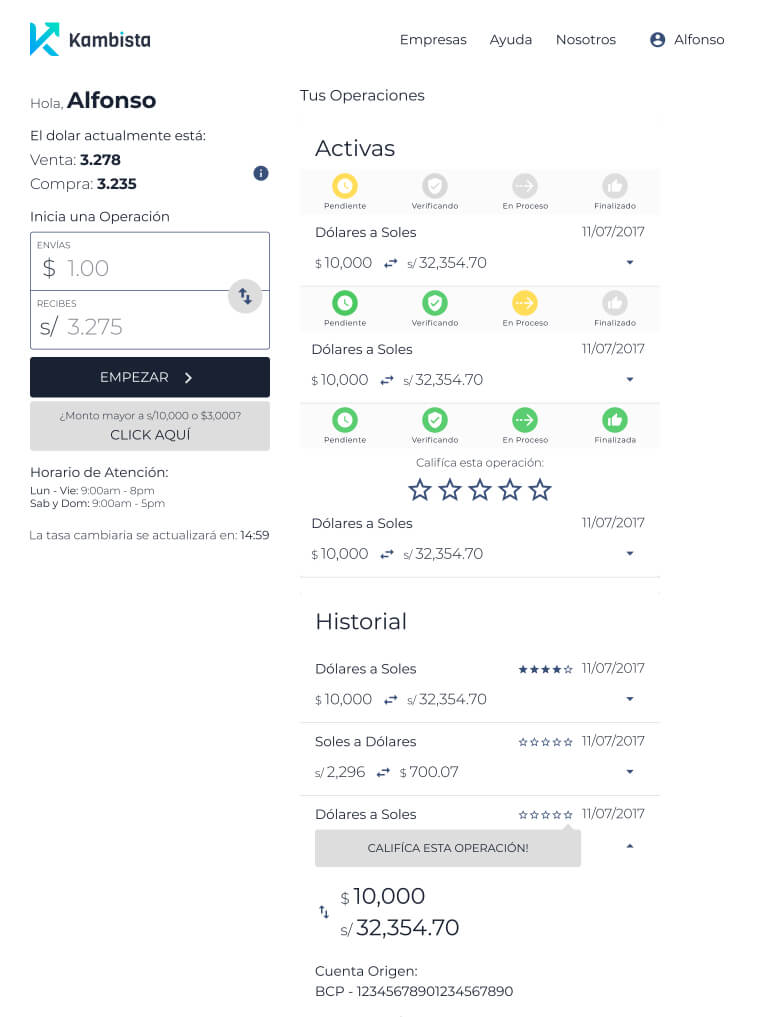
To resolve this, we conducted extensive discovery and user testing sessions to isolate critical friction points. I then translated the resulting insights into optimized structural wireframes, providing the engineering team with a clear blueprint to tackle these user-flow bottlenecks.
Identified improvements
During the discovery phase, I also identified opportunities of improvements, by suggesting the implementation of new features that would improve the UX for users and help the platform to stand out in the market.
Some of those features were:
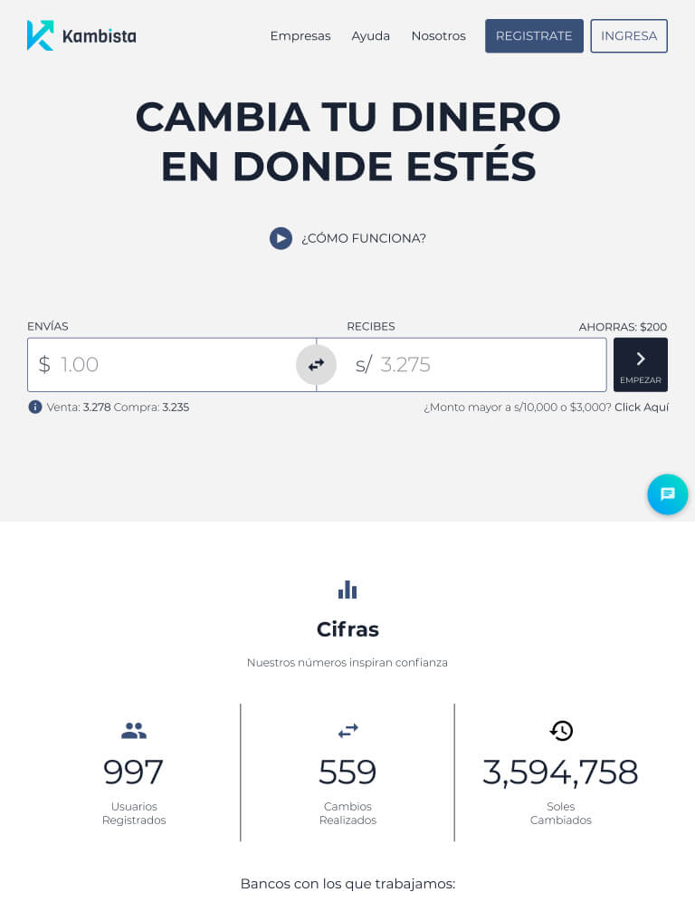
- Make the exchange calculator easily accessible from any part of the page by embedding it in the main navigation, this allows users to quickly and easily convert between currencies without having to navigate to a specific page or section.
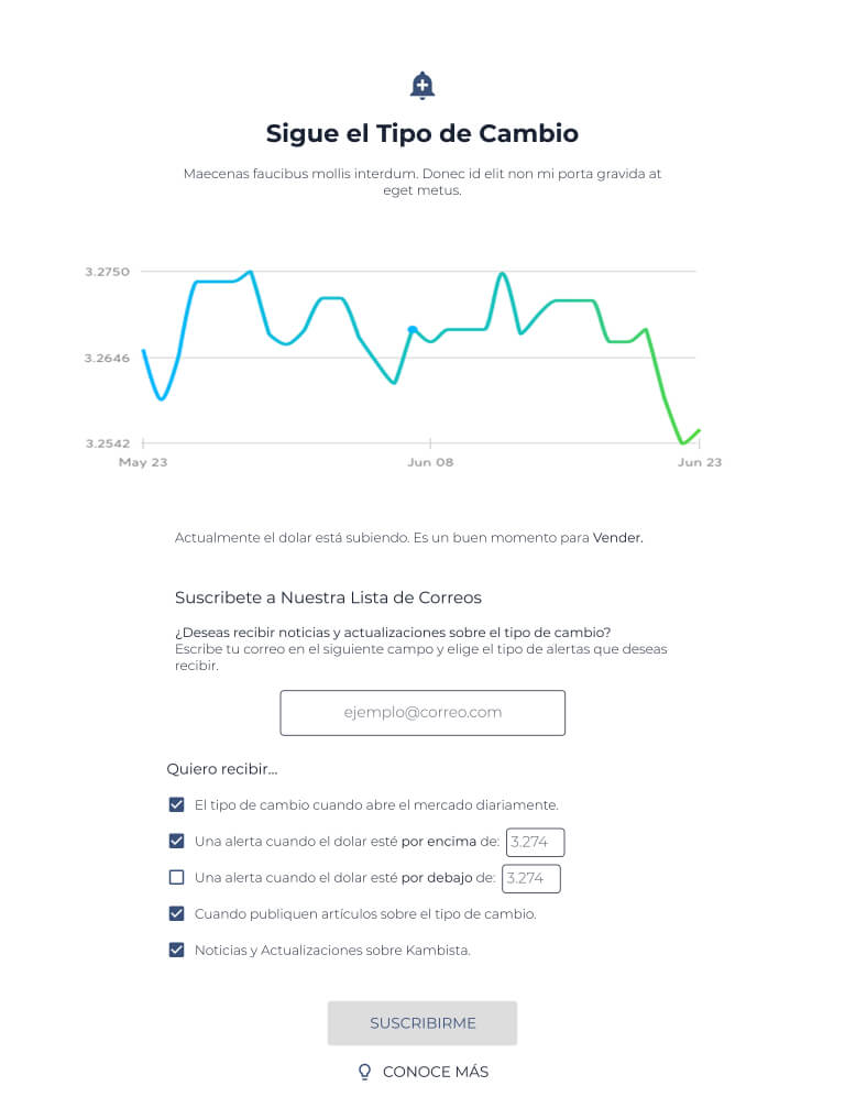
- A section in the homepage that features a line chart showing the exchange rate history of the selected currency pair, this allows users to see the trend of the exchange rate over time and make more informed decisions.
- A way to gather site visitor's information by implementing an alert system that allows users to sign up using their email to get notified when the exchange rate of their selected currency pair reaches a certain threshold.
Visual identity overhaul
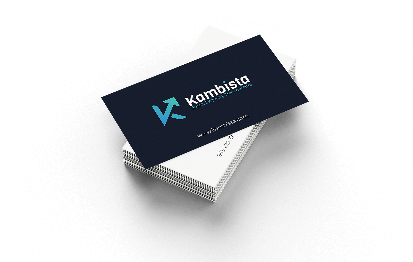
At the same time, I led a complete visual overhaul to align the brand with modern design trends to future-proof its market presence. The new design established a seamless, trustworthy identity to maximize confidence and credibility.
Key branding deliverables:
- Logo redesign.
- New color palette.
- Two new font families. One for using on titles and main copy, and another for body of text and smaller applications.
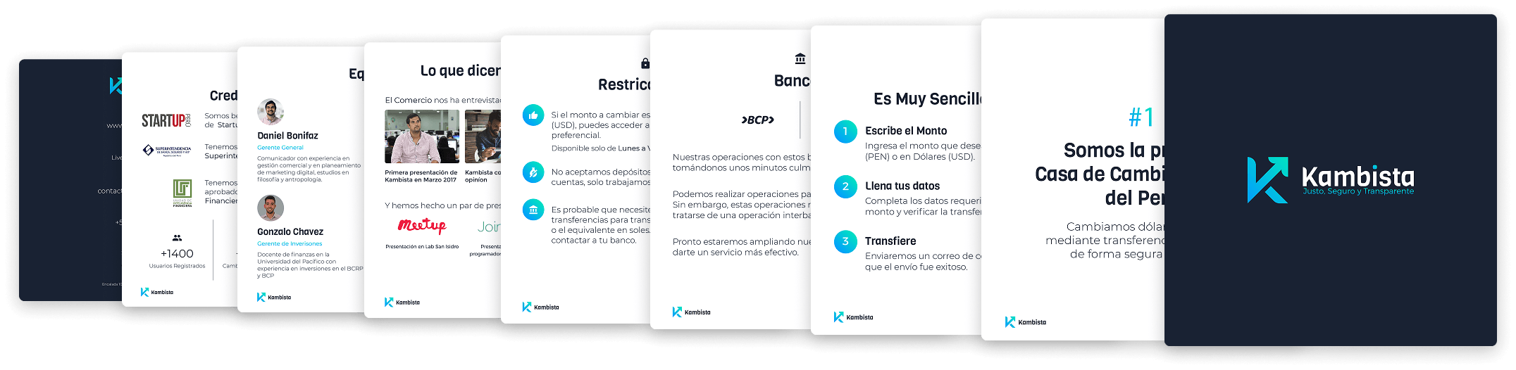
- Print assets: Business cards, letterheads, envelope templates and digital presentation layouts.